|
Emergency Vehicle Letters & Graphics FAQ on Digital Printing |
|
|
July, 2009
Spa Makeover
Our client just purchased a nail salon in May 2009. Her plan was to have us come up with a design to convert the shop into a spa with the upscale look and feel, because in addition to the nail treatments, she'll also be providing quality facial and message services. Also, it must stays within her budget.
Before we even enter the shop we noticed all the unsightly looking neon signs cluttered the window space. Then when we proceeded into the shop, it got even worse! All the walls were painted blue which made it looked like a hospital from the 70's plus the last owner decided to hang fake plants all over the place including the ceiling, felt like we were walking into a jungle.
Now the mirrors! The pervious owner placed a line of mirrors on both sides of the walls parallel to each other, so when you sit in the pedicure message chair you can see the infinite you, which made us dizzy after 30 seconds. And the lighting didn't help neither.
We want to make the spa more inviting and a place where her clients can relax and enjoy the treatments.
Below are what we have come up with:
1) Remove all neon signs from the windows as well as the curtains.
2) Remove all artificial plants from the ceiling and walls (not shown in photos).
3) Remove all mirrors from the walls.
4) Prime and paint the walls with a neutral color (We picked the Durango Dust).
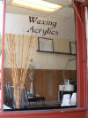
5) Install frosted glass vinyl on the windows and door from the inside and black letters on the outside (will explain later).
The reason why we installed the frosted glass vinyl stripes from the inside and the black letters on the outside is to create a natural cast shadow effect on the letters by using the thickness of the glass to separate both. When the sun moves throughout the day, so will the shadows.
Next step:
Change all florescent lights to recess lighting with warmer color bulbs to create a calmer atmosphere for her clients.
Reface the old store sign on top of the building.
If you would like us to design or redesign your retail space, please feel free to contact us.


